I’m working on a theme and want the main menu button text to be language friendly instead of having the button text baked into the PNGs.
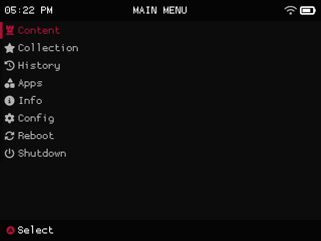
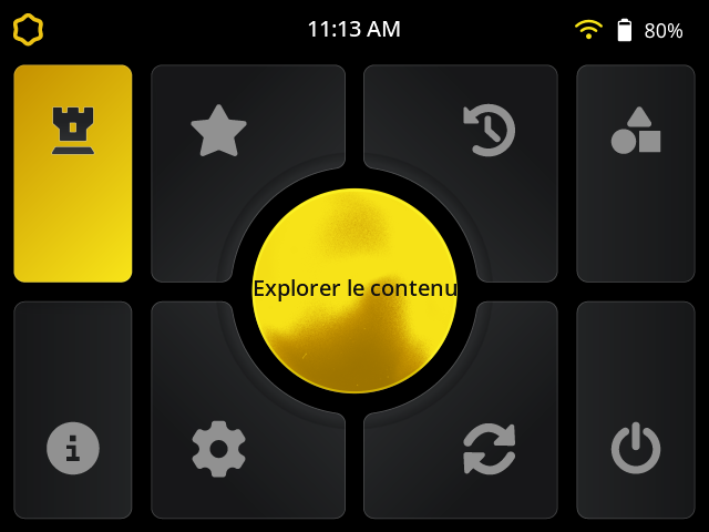
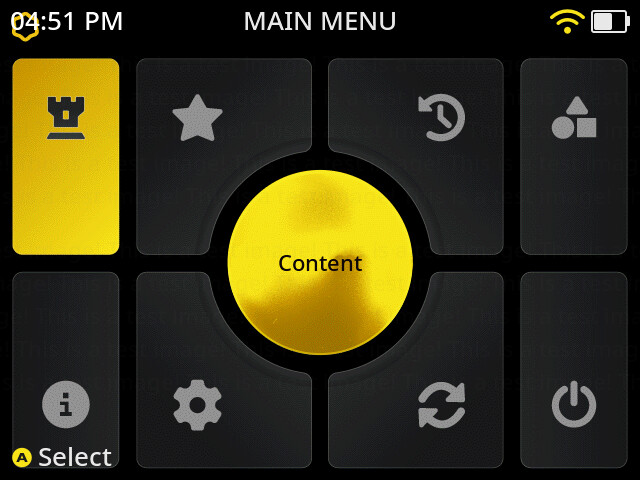
I noticed that in the grid theme the first button is “Content” but in non-grid themes that first button text is “Explore Content.”
Is there a way to have the text be “Content” in a non-grid theme? “Explore Content” takes up too much space with what I’m trying to achieve.
That only shows when in grid mode but you could try configuring it as a 1 column grid. The only other way would be to edit the language file
1 Like
Is there a reason why it’s set up like that? Maybe I can request a change in an upcoming update.
You can create language specific PNG images and place them inside the image structure.
For example image/Spanish/muxlaunch/reboot.png and the theme will use that image when users switch to the Spanish language.
2 Likes
Oh wow I didn’t know that! Thanks man!
I want to support all languages though, and making PNGs for all of them doesn’t sound very future proof. Also pretty time consuming 
I can definitely see the time consuming part for sure. The issue I currently see is if we were to allow X and Y repositioning it would create an exponential increase on both us as the developer and possibly theme creators.
Have you any ideas on what you would like to achieve or perhaps an image to visualise what you are making?
Oh no I didn’t mean x and y repositioning. I meant making the list style theme text short like the grid theme. So instead of “Applications” it’s “Apps” and “Explore Content” would be “Content.”
We’ll have a bit of a think on this one and see what happens. I don’t want to add additional variables to the scheme file if we can help it. One thought could be to have custom language files within a theme but… that could get messy?
In any case like I said we’ll think about what options we could do.
My thinking is, would it make sense to have the short text in the backend with both theme styles for the sake of consistency? I’m not asking for the ability to change it myself within the theme files. I just think the short text looks way cleaner in any kind of interface.
This is what I’m talking about. Merging the short titles from the grid theme to the list theme so that language friendly themes can have these easy to use titles on the main menu.
Having to fit “Content” on one line in a button per se, as opposed to “Explore Content”
Hmmm, we’ll definitely have a think about this one. Not saying no or that we can’t, just want to think about it further to ensure we do it correctly. 
can you give a better photoshopped example of what you would use it to create? This isn’t really a good example as there is plenty of space to display the full text. Then you talk about fitting the text on buttons but that is kind of what grid mode is so I’m having trouble picturing what you’re trying to create.
I uploaded the previous example since PNG based themes use the text from the list theme.
Since I want to support all languages, fitting text like “Explore Content” in small spaces is difficult. I’m suggesting the text be updated on list themes, like in the grid theme, to better support PNG based themes.
For example, in french “le contenu” looks and fits way better.
The only text to be updated would be:
Explore Content = Content
Applications = Apps
Configuration = Config
you should be able to do that right now using grid mode. You would set column count and row count both to 1. set column width and row width to size of the object in the middle of the screen and then set x and y offset based to center the cell on screen. there are some alphas that would need to be set to 0 but it should work. I’ll give it a try in a sec
1 Like
I didn’t update everything but you can see I was able to get it centered in there
my grid settings looked like this
[grid]
NAVIGATION_TYPE = 2
BACKGROUND = 1D2146
BACKGROUND_ALPHA = 0
LOCATION_X = 227
LOCATION_Y = 100
COLUMN_COUNT = 1
COLUMN_WIDTH = 186
ROW_COUNT = 1
ROW_HEIGHT = 186
CELL_COLUMN_ALIGN = 0
CELL_WIDTH = 186
CELL_HEIGHT = 186
CELL_RADIUS = 16
CELL_BORDER_WIDTH = 6
CELL_SHADOW = 000000
CELL_SHADOW_WIDTH = 0
CELL_SHADOW_X_OFFSET = 0
CELL_SHADOW_Y_OFFSET = 0
CELL_IMAGE_PADDING_TOP = 0
CELL_TEXT_PADDING_BOTTOM = 0
CELL_TEXT_PADDING_SIDE = 0
CELL_TEXT_LINE_SPACING = 0
CELL_DEFAULT_BACKGROUND = 686868
CELL_DEFAULT_BACKGROUND_ALPHA = 0
CELL_DEFAULT_BACKGROUND_GRADIENT_COLOR = 3F3F3F
CELL_DEFAULT_BACKGROUND_GRADIENT_START = 0
CELL_DEFAULT_BACKGROUND_GRADIENT_STOP = 255
CELL_DEFAULT_BACKGROUND_GRADIENT_DIRECTION = 0
CELL_DEFAULT_BORDER = C1E3F0
CELL_DEFAULT_BORDER_ALPHA = 0
CELL_DEFAULT_IMAGE_ALPHA = 0
CELL_DEFAULT_IMAGE_RECOLOUR = 686868
CELL_DEFAULT_IMAGE_RECOLOUR_ALPHA = 0
CELL_DEFAULT_TEXT = C1C1C1
CELL_DEFAULT_TEXT_ALPHA = 255
CELL_FOCUS_BACKGROUND = 05A3E6
CELL_FOCUS_BACKGROUND_ALPHA = 0
CELL_FOCUS_BACKGROUND_GRADIENT_COLOR = 0F4A99
CELL_FOCUS_BACKGROUND_GRADIENT_START = 0
CELL_FOCUS_BACKGROUND_GRADIENT_STOP = 255
CELL_FOCUS_BACKGROUND_GRADIENT_DIRECTION = 0
CELL_FOCUS_BORDER = CBA6F7
CELL_FOCUS_BORDER_ALPHA = 0
CELL_FOCUS_IMAGE_ALPHA = 0
CELL_FOCUS_IMAGE_RECOLOUR = E8E8E8
CELL_FOCUS_IMAGE_RECOLOUR_ALPHA = 0
CELL_FOCUS_TEXT = E8E8E8
CELL_FOCUS_TEXT_ALPHA = 255
1 Like
Thanks for the quick answer! So we can basically use the grid theme as a base for PNG themes? I’m guessing we just don’t include the “grid” folder.
yeah you would leave out the grid folder and just use the static and wall folders as usual
1 Like
Awesome! Thank you! The grid theme structure is an awesome update even for PNG themes.
I think I’ve hit a roadblock with this workaround. Since column count and row are 1, it breaks the navigation I need which is 2 or 4. Either one of those navigation settings only goes up or down.
Forgot about that, would you be opposed to full text but with line wrap?