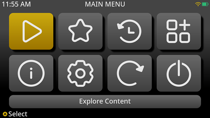
This is how it works with dafault.bin, which is originally in the theme.
However, if I use lv_font_conv to create a font as bin, it becomes like this.
As far as I know, lv_font_conv doesn’t have an option for vertical positioning.
Why is the vertical positioning of my font different from the others?
you compiled the font smaller than what is in the theme. In the default theme the height of the current item label is static and it does not center vertically so naturally if you make the font smaller you would need to adjust the top padding
In the same theme settings, only the NotoSans-Medium.ttf file I converted appears as shown in the image below. What size did you convert Panel/default.bin to?
I don’t recall, I just grabbed the footer font and copied it to the panel folder as that was slightly larger but do not remember what size I specified when creating the footer font.
but really that is irrelevant, size it to whatever size you want and then adjust padding as necessary
It’s strange that there’s such a difference with the same padding value even though the font conversion size is slightly different.
The two photos above are the original theme ini files that were used without any changes other than changing the font.
using size 26 seemed to line up the same for me maybe a pixel bigger. it’s not strange the font’s are different sizes so that is going to affect how it’s positioned.
That’s strange. In my case, when I converted it to a size of 44, it displays the same ‘E’ size as the original font.
There must be a lot of Noto Sans fonts, so is it because the TTFs before conversion are different?
yes there are a lot of not sans fonts and yes that would affect conversion. mine is called NotoSans-Medium.ttf but it is from a NotSans.zip that has a bunch of different styles
I’ve also used the same font in the same place.
I’ve discovered that the vertical alignment of a font can vary depending on how we set the Unicode range. (It has a much bigger impact than I thought.)
If I use a font size of around 41 and set the Unicode range appropriately, I get pretty similar results, though not exactly the same.
( Noto Sans medium and NotoSans Kr medium )

