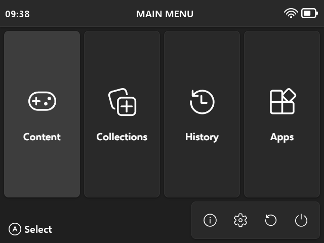
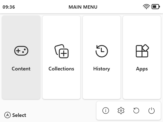
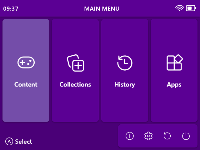
A brand new theme made with Microsoft’s Fluent Design principles in mind, but with some tweaks to make sure it fits the capabilities of handhelds and muOS.
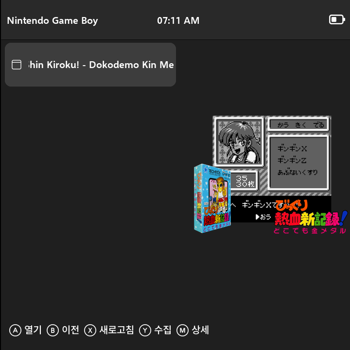
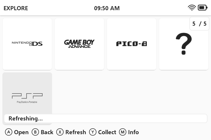
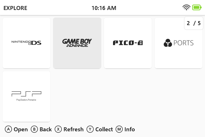
This slick, simple and modern theme comes with support for every resolution handled by muOS, new icons from Fluent Icons set, content and application grid mode support and, as always, Polish version built-in.
Since it uses the new method of including grid images, it’s incompatible with versions of muOS prior to Canada Goose.
Latest versions also support Jacaranda release!
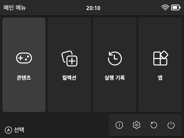
Language support: English, Polish, Korean, French, Portuguese (BR), Spanish, Italian
Ok, I’ve merged it. I’ve already prepared Korean font support for the toolkit, so I’ll do some quick checks and it will be available in a couple of minutes if nothing breaks
Yeah, there’s some incompatibilities with folder namings between recent versions of muOS. The version without the dash is the change that works in the latest version. I’ll add the older one for compatibility
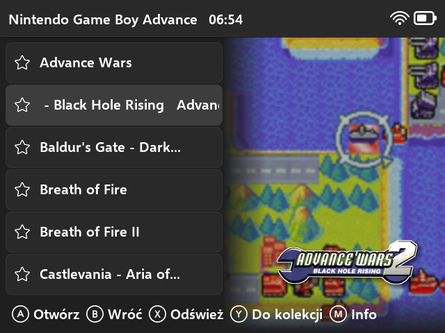
There are four templates included: screenshot-fluent and screenshot-fluent-no-offset and their 768p counterparts. The first one slightly offsets the screenshot to the right, to compensate for the space taken by the list and to frame the screenshot more to the middle of the remaining space. The second one does not offset the screenshot. This is great for systems that can have vertical screenshots, e.g. DS, Arcade.
I went ahead and tried this theme out on the TrimUI Brick (1024x768) and noticed it looked a little different from the screenshots. I then noticed you were asking for alternate resolution testers, so I figured I’d contribute my experiences. I come from a design background as well, so I’m hoping that makes my feedback more usable.
I’m also not seeing a way for me to attach images… perhaps because my account is new? I’ll link off to imgur.
I believe the font sizes of the menu options (and other elements) may not be scaled appropriately for this resolution. Switching away from the theme font helps, but not an ideal solution
Issue with element margins:
The spacing between elements appears tighter than it does on the 640x480 screenshots. I think this is because it’s using the same pixel values and as such looks smaller/more dense on the higher resolution screen. My guess is that these values need to be scaled, if that’s not too annoying.
I’ve not yet taken the plunge into muOS theming so I don’t know what level of effort it’d take to correct these issues. I’m happy to continue testing updates and changes as I appreciate the thoughtfulness that went into this theme and would love to see it at its best on the brick!
I’m not sure if there’s a way to make fonts bigger, they’re rendered by muOS and I haven’t found a way to control that using theme schemas and I’m unable to do much at this moment.
I made header and footer scale with screen height, so it’s easier to generate complete packages with my toolkit. Pretty much all of the resolution spacing is calculated in relation to one of dimensions of the screen. I guess it could be improved, but the true solution would be the ability to have bigger fonts displayed in some places, as I’m not sure if making header and footer height equal to dimensions from 640x480 wouldn’t look bad on other resolutions.
I’ll do some more experiments with theme schemas, because maybe I’m missing something.
Hmmm, having different fonts for header and footer for different resolutions might do the trick. But I’ll also try to unify the footer and header height, that might work just right
I’m not sure I follow a resolution of 1024x768 is a 1.6 scale of 640x480 so it naturally is going to have headers and footers 1.6 times larger than the 640x480 resolution if you want things to look the same
I’ve taken Bitter_Bizarros advice and added bigger fonts for other resolutions. Can you test if this one works better for you? Tell me if font is too big or overlaps something.