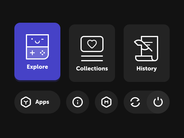
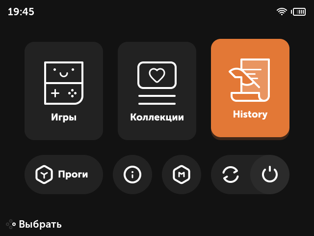
* I made 1280x720 resolution to look nice on HDMI output, so on TrimUI Smart Pro scaling will look too tiny. Will add support for it later, when it will be official supported by muOS.
Feel free to provide some feedback.
If you want main menu to be translated to your language, write your translations and I can easily make it.
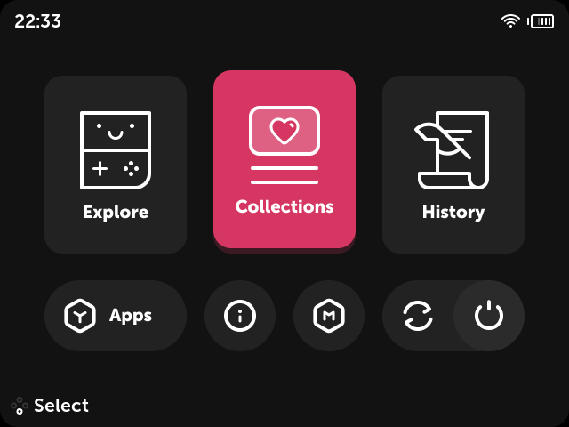
Also if you have in mind some color alternatives, i am open to any suggestions.
Hey, guys! I’ve added support for 720x720 and 1280x720, but it needs to be tested because i might miss something. Some help will be really great. You can dowload it here: Release v1.1 testing · bulkh/OneTwo · GitHub
If you see that something is not looking right, please tell me and i will look for it
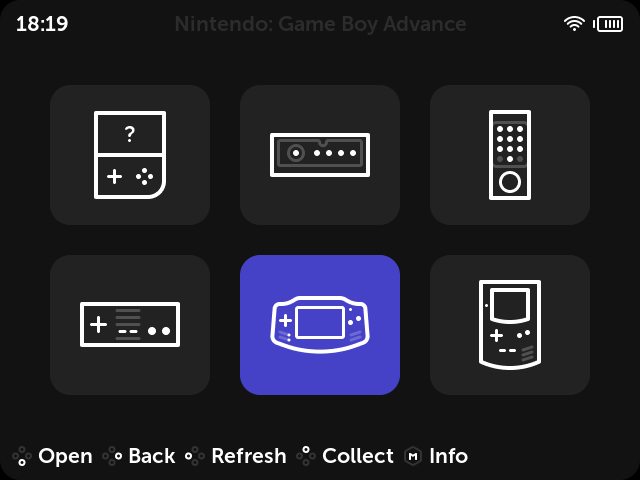
Hey, I use the RG Cube XX so I can test out the 720x720 update. Initial impressions seem great. I really enjoy the minimalism approach in favor of icons for the handheld/controllers. I also like the cart icon more than the Pixie default theme of a paper. There’s only one issue I found immediately, and that’s in the theme picker. The previews for each theme is on the left, so it blocks the names of several themes when you’re trying to choose one. On the default theme, the preview is on the right. Awesome work, though.
Find out the prombem, there was parameter that should’ve been for 1280x720 resolution and i accidentaly put it to 720x720. It was also causing games atworks going to the left side. Now everything is fine, you can download it again from github, i updated the file.
This is pretty much exactly what I’ve been looking for in a theme, great job! I don’t have console icons in Content Explorer though, should I use the ones provided by the Aurora theme or am I missing something?
Thank you! There should be concole icons i’ve done myself, that are different from Aurora. Can you show me your content explorer? Maybe try to reapply the theme. Or maybe your console folders are not named the way the system understand wich console is in curtain folder. Do you have console icons with another theme?
I tried the theme on another console and it worked fine, I then had to reflash pixie on the first console and after that everything worked as well. So totally an issue on my end, sorry!
Please don’t tag me in random questions. It’s a forum just ask your question no need to tag anyone. I don’t know the answer to this off the top of my head.
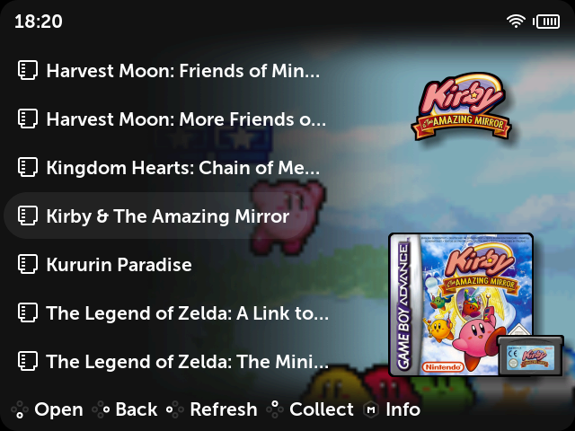
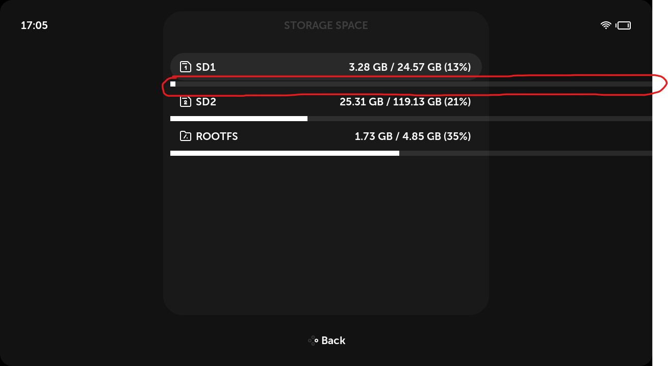
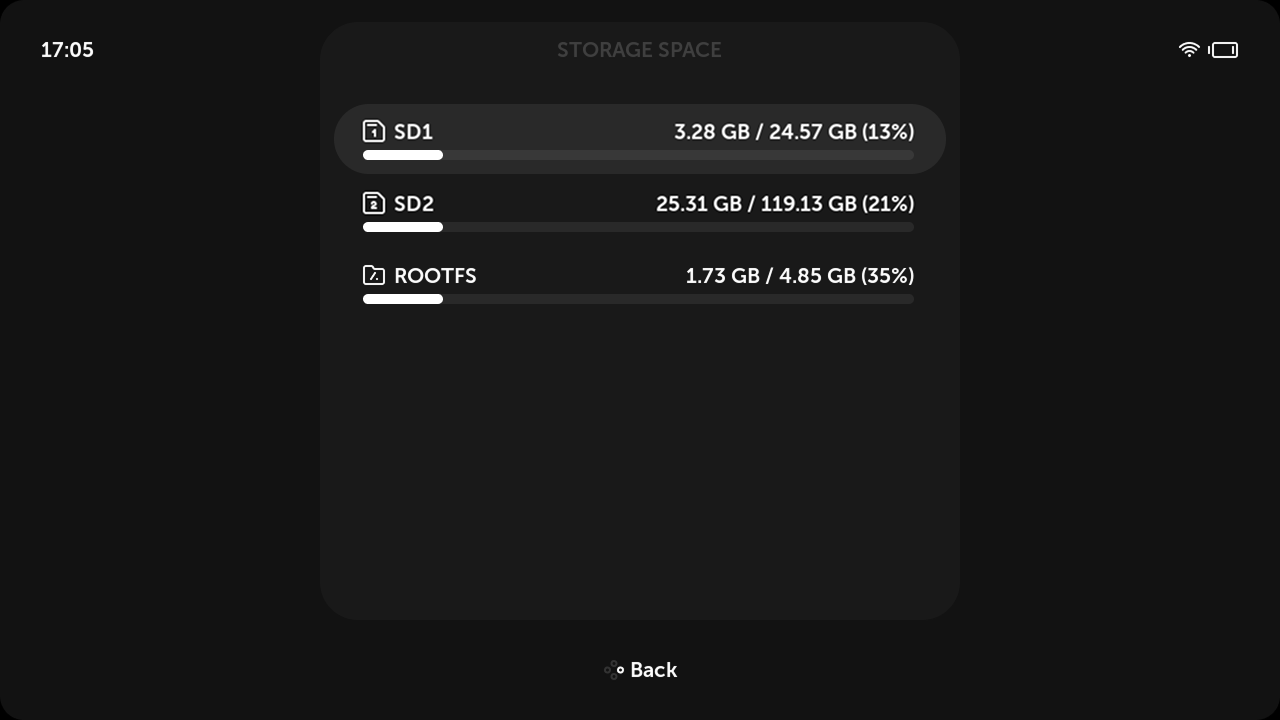
Thank you! Do you have in plan to add customization to this elements? Since the storage bar is starting from the begining of content, maybe it could end on the end of the content? Also adding round corners will look nice imo. It will look even better if it will be part of content in the list
And maybe you can add transparency for divider and setting its width
I’ve also noticed that folder icons are not in line, but can’t understand which parameter sets it’s padding
i don’t know how it works, but maybe it should be just like a normal list, but the game in the list is showing with additional padding and shortned width, something like theme provided [misc] CONTENT_PADDING_LEFT+X for left padding and [misc]CONTENT_WIDTH-X for width, where X=[list]LIST_DEFAULT_GLYPH_PAD_LEFT+(width of icon devided by 2), or something else instead of X