This has information on how the Storage menu works.
1 Like
I’ve followed that video too the first time, but I guess I misunderstood some things. No problem. I’ve learned with my mistakes.
About your theme, I’m not getting the corners to stay completely round. Am I the only one?
It boots correctly though.
This version is from muos themes website. Happens with all the colors.
The fisrt time I tried your theme, I had downloaded it from github and the corners were correct. I’ve download it before the last you made there.
I had to reflash muos again and the corners were not “totally” round before that too.
Could I’ve done something wrong? I had all the override files correctly this time and only change the content_width.
I guess I should have read that and not saw only videos.
Thank you! ![]()
1 Like
You should set Overlay Transparency (in Interface Options) to 255
1 Like
All good now. Thank you!
1 Like
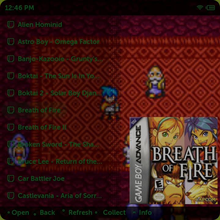
When you select DMG or SFC themes, it’s like there’s a haze on the screen, so you can’t see the non-black lettering and covers well. I don’t know how to reconfigure it, it doesn’t seem right to me.
It’s also bad to see text on the charging screen. On all themes.
I believe this is what they mean. I think it’s an overlay image, but I do think it’s a little over-tuned. I really love the DMG green on my Cube. But it’s kind of too hard to see sometimes. And it makes the box art look bad.
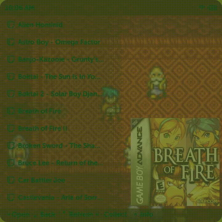
I made it on purpose to give box art a better match with color scheme. I’d rather make full recolor to background color, keeping the contrast, like “Hue” mode for color layer in photoshop or another program. You can turn it off in override folder in files muxcollect.ini , muxhistory.ini , muxplore.ini by adding [image_list] secrion and this line IMAGE_LIST_RECOLOUR_ALPHA = 0.
I made some text half transparent to give overall system more simple look, this is the way i like. I have no problem with reading the text, only on sun sometimes, but increasing the brightness usually helps. If you don’t like it, you always can adjust theme to your taste, it’s not that hard, everything is written here.
2 Likes
Maybe fullscreen box arts doesn’t match with this color scheme because of bad contrast with text color. I like the way it looks with this boxarts
You can try turnig off recolor of box art images as i wrote in previous post.
BEFORE AFTER
This definitely looks better for me, and keeps the menus looking nice and green. Now I need to get the lines for overwriting the Text Color.
Thank you for responding and helping!
1 Like
Do you have any idea why my system icons won’t show? They are all the same size. I tried my folder name scheme and yours.

I guess it’s because of CELL_DEFAULT_IMAGE_RECOLOUR and CELL_FOCUS_IMAGE_RECOLOUR. I’m using sinlge color system images and recolor it according to selected alternate theme. If you want to use your images, you need to set CELL_DEFAULT_IMAGE_RECOLOUR_ALPHA and CELL_FOCUS_IMAGE_RECOLOUR_ALPHA to 0. All this is in [grid] section, you need to add this in override folder in muxplore.ini or in theme itself.
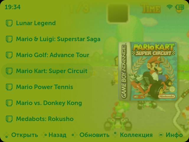
Is there a scrappy template for your box images you are using in the preview for the theme? Look great! Thanks for sharing with us.
Can I just send you the the translations for my Language for the Main Screen?
Hi! Yes, you can, i’ll try to do it in spare time.
I need translations for “Content explorer” (or “Explorer” or “Games”), “Collections”, “History”, “Applications” (or “Apps”) and “Exit”. Make shure to find some short words for translation or there’s not that much space to fit.
What issue do you have?
Hi,
thank you for the quick response. I already fixed my issue. I didn’t have the newest version of PIXIE so I just updated it and I thought I deleted the post already but you were quicker with responding haha.
That would be awesome if you could do that.
The translations would be:
Explore = Spiele
Collections = Favoriten
History = Verlauf
Apps = Apps
Exit = Exit
And two more questions:
What are the differences with the normal versions and the one that says ‚GamePal‘ at the en.
And what are your preferred settings for the box arts? I have added some using skraper with 300 width, but it doesn’t look as good as in your preview images
I used this template in Scrappy app.
But then I modified it a bit and made new template.
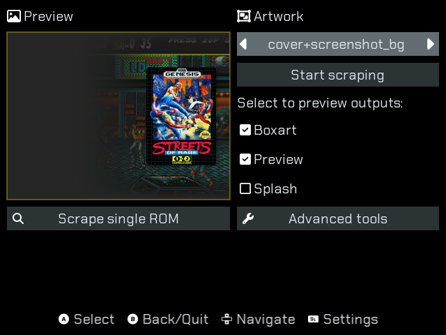
You can intall it using this file.
cover+screenshot_bg.muxapp (10.8 KB)
This template will only work with this additional installation for Scrappy (first intall latest version of Scrappy and then this).
Skyscraper_3.17.0_72b2921.muxapp (634.0 KB)
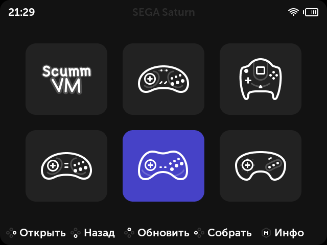
I would suggest changing the icons for the Sega platforms because they all look very similar now. A good example is how it’s done in Aurora - in the form of titles. In our case it would be enough to add a small writing at the top or bottom of icon.